Multiple Choice

The Multiple Choice component allows users to select one or more options from a predefined list. It is commonly used for collecting selections where multiple answers may apply.
How It Works
The Multiple Choice component displays a group of selectable options as checkboxes. Users can select any number of options unless restricted by validation rules.
You can configure the component's label, available options, required state, layout, and display behavior to match your form requirements.
Properties
| Property | Description |
|---|---|
| Label Name | The text label displayed above the field. |
| Hide Label | Option to hide the label visually while keeping it accessible to screen readers. |
| Disabled | The field is still displayed, however it can not be filled out. |
| Displayed Options | List of options displayed as checkboxes that users can select from. |
| Add Option | Create additional options for users to choose from within the component. |
| Make Required | Marks the field as required. The user must select at least one option before submitting or continuing. |
| Add CSS Class | Apply custom CSS classes to style the field to match your branding or layout. |
| Display Component in Navigation | Option to include this component in any summary or form navigation (if applicable). |
| Unique Name | A required identifier that must be unique within the form. Used in variables, email templates, webhooks, and integrations. |
| Horizontal Checkbox Group | Multiple choice checkboxes are displayed vertically by default. Enable this option to display them horizontally. |
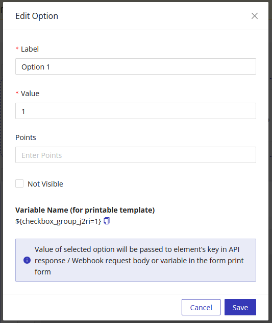
Adding Options
When configuring options, each option includes the following attributes:
- Label - Text displayed to the user
- Value - The value passed in API responses, webhooks, and form variables
- Points - A numeric value used in calculation or scoring tables (if applicable)
Using Multiple Choice Values in Other Parts of the Form
You can reference the provided multiple choice values elsewhere in the form (e.g., success pages, PDF templates, notification emails) using the component's Unique Name as a variable.