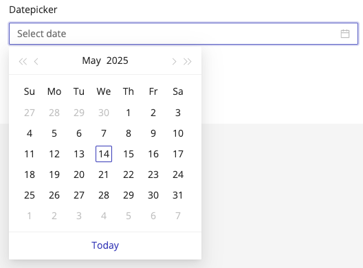
Datepicker

The Datepicker component provides a user-friendly calendar interface for selecting dates. It helps standardize date inputs, reduce manual errors, and ensure consistent formatting across submissions.
Use the Datepicker component when you need users to select a specific date - such as:
- Consent or Signature Dates
- Service Start or End Dates
- Follow-up or Reminder Dates
While it's common to use the Datepicker for a Signature Date, a more efficient approach is to use a Paragraph Text component with the ${date-today} variable.
This automatically displays the current date without requiring the user to select it manually.
How It Works
The Datepicker displays a clickable calendar popup, allowing users to select a date with ease. You can customize its label, placeholder, required status, date format, and additional behaviors to match your form requirements.
Properties
| Property | Description |
|---|---|
| Label Name | The text label displayed above the datepicker field. |
| Hide Label | Option to hide the label visually while keeping it accessible to screen readers. |
| Disabled | The field is still displayed, however it can not be filled out. |
| Add Placeholder | Placeholder text shown inside the field before a date is selected. |
| Make Required | Marks the field as required. The user must select a date before moving forward or submitting. |
| Add CSS Class | Apply custom CSS classes to style the field to match your branding or layout. |
| Date Format | Defines how the date is displayed and stored (see supported formats). |
| Display Component in Navigation | Option to include this component in any summary or form navigation (if applicable). |
| Clear When Information Update Is On | When enabled, the field will be cleared for returning users if the Information Update setting is active in Form Settings. This ensures that updated entries are always collected. |
| Unique Name | A required identifier that must be unique within the form. Used in variables, email templates, webhooks, and integrations. |
| Variable Name | A variable identifier that can be copied to collect information in printable PDF or Word forms. |
| Mask in Notification Email | Masks the submitted value of this field in email notifications for enhanced privacy and compliance. Useful for preventing exposure of sensitive or identifiable information. |
📆 Supported Date Formats
You can configure how the date appears in both the form and submission data by choosing one of the following formats:
| Format | Example Output | Description |
|---|---|---|
MM-DD-YYYY | 05-28-2025 | Month-Day-Year, dash-separated |
MM/DD/YYYY | 05/28/2025 | Month-Day-Year, slash-separated |
MM/DD/YY | 05/28/25 | Month-Day-Two-digit Year |
YYYY-MM-DD | 2025-05-28 | ISO format, Year-Month-Day |
YYYY/MM/DD | 2025/05/28 | Year-Month-Day, slash-separated |
hh:mm | 14:30 | Time-only format, 24-hour clock |
💡 Choose the format that best fits your locale, compliance needs, or system compatibility.
The Datepicker is rendered in the patient's local browser timezone.
If the patient's timezone differs from your HIPAAtizer account timezone - or the form's location timezone (if defined)-the selected date will be automatically converted to the account or location timezone in:
- Form submission data
- Printable form output
- Variable rendering (e.g.,
${appointmentDate}) - Preview within the dashboard
This ensures consistent interpretation of dates across different timezones.
Using Date Values in Other Parts of the Form
You can reference the selected date elsewhere in the form (e.g., success pages, PDF templates, notification emails) using the component's Unique Name as a variable.
If your Datepicker has the Unique Name appointment_date, you can use ${appointment_date} to insert the selected date wherever needed.