Address

The Address component allows users to enter their complete address in a structured format. It includes individual fields for each part of the address, ensuring clean data collection and easier processing for downstream systems.
Fields Included
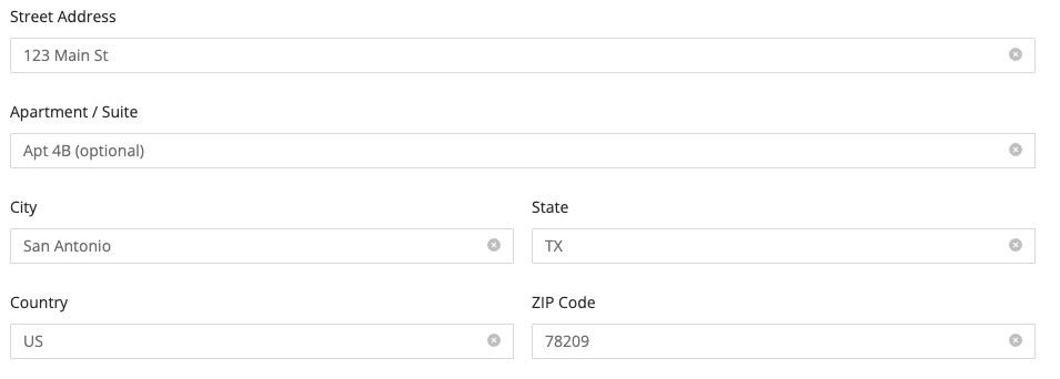
When you add the Address component to your form, it will automatically include the following fields:
- Street Address
- Apartment / Suite
- City
- State
- Country
- ZIP Code
These fields are grouped together and treated as a single logical input block on the form.
Autocompletion Options
By default, when a user starts typing their Street Address, most modern browsers will suggest previously entered addresses using built-in browser autofill.
Google Places Autocompletion (Optional)
To provide real-time address suggestions from Google Maps, you can enable Google Places Autocompletion.
This feature offers more accurate and standardized addresses as users type, improving data quality and form usability.
🔧 How to Enable:
- Go to Integrations → Integrated Accounts → Google Maps
- Enter your Google Places API Token
- Ensure billing is enabled in your Google Cloud Console
- Save the integration
Once the integration is connected:
- Go to the form builder
- Select your Address component
- In the Component Settings, toggle on Enable Autocomplete
💡 When both the integration and the toggle are enabled, the Address component will use Google Places to suggest matching addresses after the user types at least 5 characters.
Properties
| Property | Description |
|---|---|
| Hide Labels | Hides field labels. |
| Disabled | Disables the field, making it read-only for the user. |
| Enable Autocomplete | Enables Google Places address autocompletion (requires integration and Places API token). |
| Countries | (Visible only when Autocomplete is enabled) Restricts Google Places suggestions to specific countries (default: US). |
| Add Placeholders | Adds placeholder text to each address input field. |
| Make Required | Makes all address fields except "Apartment / Suite" mandatory before submission. |
| Display Apartment/Suite Field | Toggles the visibility of the "Apartment / Suite" input field. |
| Add CSS Class | Applies custom CSS classes to style the component. |
| Display Component in Navigation | Includes the Address component in any form navigation or summary views. |
| Mask in Notification Email | Masks the submitted value of this field in email notifications for enhanced privacy and compliance. Useful for preventing exposure of sensitive or identifiable information. |
| Unique Name | A required identifier that must be unique within the form. Used in variables, email templates, webhooks, and integrations. |
| Variable Name | A variable identifier that can be copied to collect information in printable PDF or Word forms. |
Using Address in Other Parts of the Form
The Address component automatically creates a group of variables based on its Unique Name, allowing you to reference individual address fields throughout your form logic, templates, and integrations.
For example, if your Address component has a Unique Name of patient_address, the following variables become available:
| Variable | Syntax | Description |
|---|---|---|
| Full Address | ${patient_address} | Full formatted address (single line). |
| Street Address | ${patient_address.street} | Primary street address. |
| Street Name | ${patient_address.streetName} | Primary street name. |
| Street Number | ${patient_address.streetNumber} | Primary street number. |
| Street Address 2 | ${patient_address.street2} | Apartment, suite, or unit number. |
| City | ${patient_address.city} | City name. |
| State / Province | ${patient_address.state} | State or province. |
| Country | ${patient_address.country} | Country name. |
| ZIP / Postal Code | ${patient_address.zipcode} | ZIP or postal code. |