Dropdown Select

The Dropdown Select component provides a user-friendly input interface for selecting an option from a pre-determined list.
How It Works
The Dropdown Select component displays a clickable dropdown menu, allowing users to choose a specific option that is relevant to them from a pre-determined list of options. Dropdowns can be preferable to single-choice lists if there are many options to choose from, and you would like to conserve space on your form.
You can customize its label, enabled/disabled, displayed options, required status, and additional behaviors to match your form requirements.
Properties
| Property | Description |
|---|---|
| Label Name | The text label displayed above the field. |
| Hide Label | Option to hide the label visually while keeping it accessible to screen readers. |
| Displayed Options | How the options in the component will be displayed. Edit the options to alter their text, as well as their value if being used in a scoring system. |
| Add Option | Create additional options for users to choose from within the component. |
| Add Placeholder | Placeholder text shown inside the field before an option is selected. |
| Make Required | Marks the field as required. The user must select an option before moving forward or submitting. |
| Add CSS Class | Apply custom CSS classes to style the field to match your branding or layout. |
| Display Component in Navigation | Option to include this component in any summary or form navigation (if applicable). |
| Unique Name | A required identifier that must be unique within the form. Used in variables, email templates, webhooks, and integrations. |
| Variable Name | A variable identifier that can be copied to collect information in printable PDF or Word forms. |
| Mask in Notification Email | Masks the submitted value of this field in email notifications for enhanced privacy and compliance. Useful for preventing exposure of sensitive or identifiable information. |
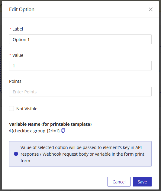
Add Options
When adding options, you can adjust the Label and Value that are tied to each option.
Label - Text representing the option Value - Value of selected option will be passed to element's key in API response / Webhook request body or variable in the form print form
Using Dropdown Select Values in Other Parts of the Form
You can reference the dropdown value chosen elsewhere in the form (e.g., success pages, PDF templates, notification emails) using the component's Unique Name as a variable.