

Rows and Tables
The HIPAAtizer Form Builder gives you two ways to structure content on a screen: Rows and Tables. Both are containers that hold form components, but they serve different purposes and behave differently for the end user.
Not sure which to use? Use a Row when you want a standard layout with side-by-side fields. Use a Table when you need structured, grid-style data: either a list of questions with shared answer columns, or a repeatable set of inputs users can add rows to.
Rows
A row is the standard building block for laying out components on a form screen. Every component in the form builder lives inside a row.
Column layouts
By default, a new row has a single column that spans the full width. You can split it into 2 or 3 columns to place fields side by side, for example, a First Name and Last Name field in the same row.
To add a row:
- Click + Add Row at the bottom of a screen. A new single-column row is created.
- Drag components from the Components panel into the row's Drop Here zone.
To split the row into columns:
- Click the Split Row () button on the row toolbar.
- Choose 2 columns or 3 columns.
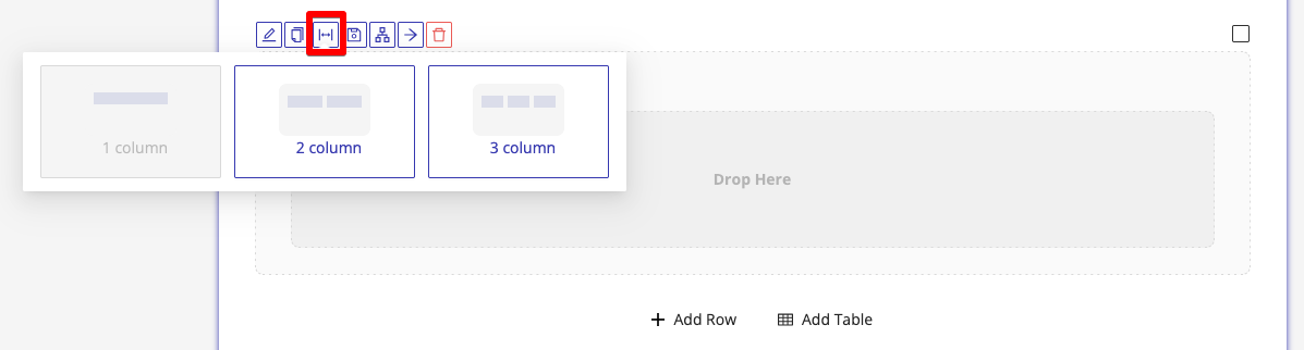
On mobile devices, all row columns automatically stack vertically, from left to right. No additional configuration is needed.
Row settings
Each row has its own settings panel, accessible by clicking the Edit () icon on the row toolbar. From there you can:
- Set a title for the row (optional, for internal reference)
- Hide the row from end users (Hide Row)
- Mark the row as Internal Use, visible only to staff after submission
- Add a CSS class for custom styling
- Configure Conditional Logic to show or hide the row based on user input
Tables
Tables are a more structured layout type designed for specific use cases. You can insert a table by clicking Add Table at the bottom of a screen, then choosing the table type.
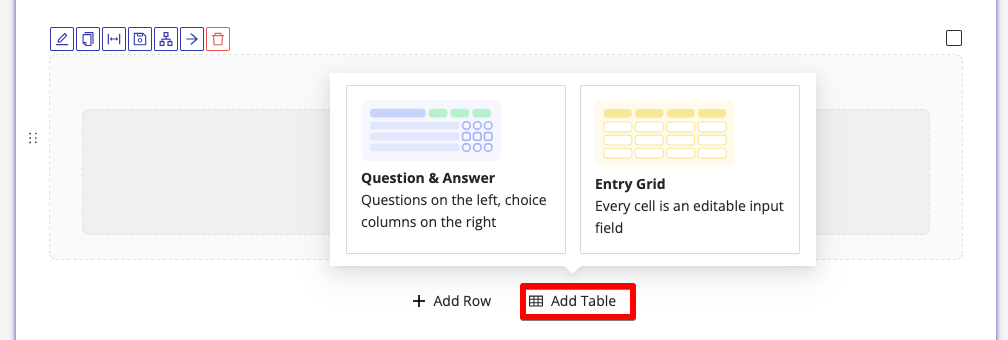
There are two table types:
Question & Answer Table
The Question & Answer table is designed for forms where you want to ask a set of similar questions with a shared set of answer options, for example, a symptom checklist where each question can be answered with Yes, No, or N/A.
How it works
The table displays questions as rows and answer options as columns. Each question is a Single Choice or Multiple Choice component, the component's label becomes the question text in the left column, and its answer options map to the columns on the right.
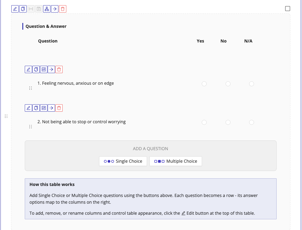
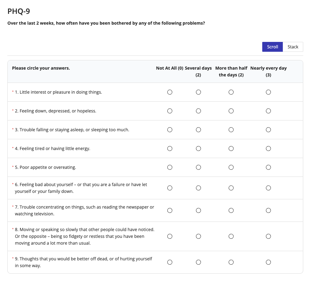
When the form is published, the end user sees a clean grid where they can select an answer for each question without scrolling through long individual fields.
Adding questions
When you add a Q&A table, an empty row appears with a prompt to add a question. Click either:
- Single Choice, for questions where only one answer can be selected per row
- Multiple Choice, for questions where more than one answer can be selected
Each component you add creates a new question row in the table.
Only Single Choice and Multiple Choice components can be added to a Q&A table. Other component types are not supported in this layout.
Configuring columns
The Q&A table is created with default columns: Question, Yes, No, and N/A. You can rename, reorder, or remove these columns, and add new ones, by clicking the Edit () icon on the table's toolbar.
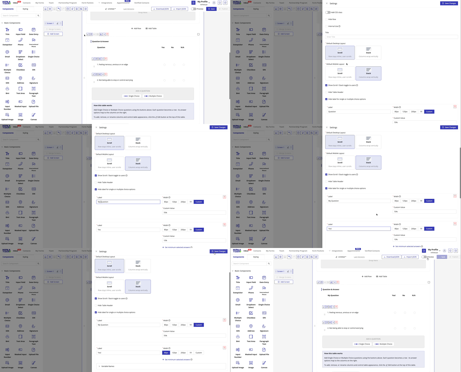
From the table settings you can:
- Rename columns, change "Yes / No / N/A" to any labels that suit your questions
- Set column widths, choose from preset widths (10%, 15%, 25%, 50%, 70%) or enter a custom value
- Add or remove columns, click + Add Column to add a new choice column, or use the delete button to remove one
To add or remove columns, you must first delete all components inside the existing columns. The table structure cannot be modified while components are present.
Table appearance settings
Also accessible from the Edit () button:
| Setting | Description |
|---|---|
| Default Desktop Layout | How the table behaves when columns are too wide to fit: Scroll keeps them inline with horizontal scrolling, Stack wraps columns vertically |
| Default Mobile Layout | Same options, applied specifically to smartphone screens |
| Show Scroll / Stack toggle to users | When enabled, end users can switch between Scroll and Stack themselves on the published form |
| Hide table header row | Removes the column label row from the published form |
| Hide choice labels | Shows only the radio button or checkbox control in each cell, without the option label text |
Entry Grid
The Entry Grid is designed for collecting structured, repeatable data, for example, a list of current medications, a history of medical visits, or a set of emergency contacts.
How it works
The key concept: you build one table row, and the Entry Grid makes it repeatable for the end user.
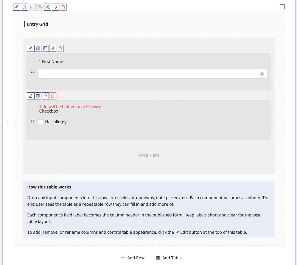
Drop components into the Entry Grid in the form builder, each component represents one column of data. On the published form, the user sees those fields arranged in a single row, and can click Add another row to enter additional entries.
In the form builder, the Entry Grid shows you the fields that will be in the table, not how end users will see them:
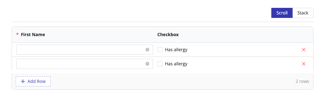
To preview the actual table row layout that end users will see, toggle Preview at the top right corner of the form builder:
Building the grid
- Click Add Table and select Entry Grid.
- Drag any input components, text fields, checkboxes, date pickers, dropdowns, etc., into the grid's drop zone.
- Each component becomes one column. The component's field label becomes the column header on the published form.
- To rename a column header, edit the label of the corresponding component.
You can use any combination of supported component types. For example, a medication log might include a text field for the medication name, a date picker for the start date, and a checkbox for whether it is currently active.
The following components cannot be dropped into an Entry Grid:
- Title
- BMI
- Paragraph
- Upload File
- Upload Image
- Image
- QR Code
- Divider
- PayPal
- Custom HTML
- Total
- Height
- Upload Video
- QuickBooks
- Appointment
- Stripe Payment Element
- Square Payment
Keep component labels short and descriptive, they appear as column headers in the published grid. Long labels can make the table hard to read.
Grid settings
Click the Edit () icon on the Entry Grid toolbar to open the settings drawer. The top of the drawer shows column widths, one width selector per component you've added. Below that are the general layout and behaviour settings.
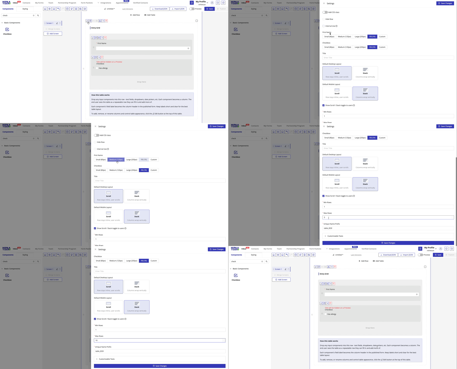
Column widths
For each component in the grid, choose a width preset or enter a custom value:
| Preset | Width |
|---|---|
| Small | 80px |
| Medium | 120px |
| Large | 200px |
| Fill | 1fr, fills all remaining space |
| Custom | Enter any value in px, %, or fr (e.g. 200px, 25%, 0.5fr) |
General settings
| Setting | Description |
|---|---|
| Add CSS class | Add a custom CSS class to the table row for styling |
| Hide Row | Hide this table from all end users on the published form |
| Internal Use | Hide the table from patients, visible to staff only after submission |
| Title | Optional label for internal reference (not shown on the published form) |
Layout & behaviour
| Setting | Description |
|---|---|
| Default Desktop Layout | Scroll: the table stays inline and scrolls horizontally if columns don't fit. Stack: columns wrap vertically when the table is too wide |
| Default Mobile Layout | Same Scroll / Stack options applied to smartphone screens. Defaults to Stack |
| Show Scroll / Stack toggle to users | When checked, end users can switch between Scroll and Stack themselves on the published form |
| Min Rows | The minimum number of rows the user must fill in. Defaults to 1 |
| Max Rows | The maximum number of rows the user can add. Defaults to 5 |
| Unique Name Prefix | Auto-generated identifier used to reference this table's data in email notifications, webhooks, and PDF templates |
| Customizable Texts | Expand to edit user-facing labels such as the "Add another row" button text |
Referencing grid data in variables, emails, and PDFs
Because an Entry Grid repeats, each field is referenced once per row. Combine the grid's Unique Name Prefix, the row index (starting at 0), and the component's Unique Name:
${<prefix>.<rowIndex>.<componentName>}
For a grid whose Unique Name Prefix is medications, containing a component named medication_name, the first two rows are ${medications.0.medication_name} and ${medications.1.medication_name}. Reference rows only up to the grid's Max Rows value; higher indexes are never filled.
See Variables for the full reference, and Create a Custom PDF for the same naming convention in printable templates (there the ${ } wrapper is omitted).
A Question & Answer table is not repeatable: each question is its own component with its own Unique Name, so reference those components directly, with no prefix and no row index.
How tables appear to end users
Both table types support two display modes, Scroll and Stack, which control what the table looks like when it's too wide for the screen. By default, tables use Scroll on desktop and Stack on mobile, unless you set different defaults in the table settings.
If Show Scroll / Stack toggle to users is enabled, a small toggle appears above the table on the published form, letting users switch between modes themselves.
Scroll mode
The table renders as a standard grid with columns displayed side by side.
- Q&A table: questions appear in the left column, with answer columns (Yes, No, N/A) to the right. If the table is wider than the screen, the user scrolls horizontally.
- Entry Grid: all input columns appear side by side in a single row. An + Add Row button sits below the table, along with a row count (e.g. "3 rows"). Each row has a delete button on the right.
Stack mode
Each row or entry is displayed as a card, with fields stacked vertically inside it. This is the recommended layout for mobile screens.
- Q&A table: each question becomes its own card. The answer options (Yes, No, N/A) are listed as labelled rows inside the card, with the radio button on the right.
- Entry Grid: each repeatable entry becomes a numbered card (1, 2, 3…). All fields in that entry are stacked vertically with their labels, and a delete (×) button appears in the top right corner of each card.
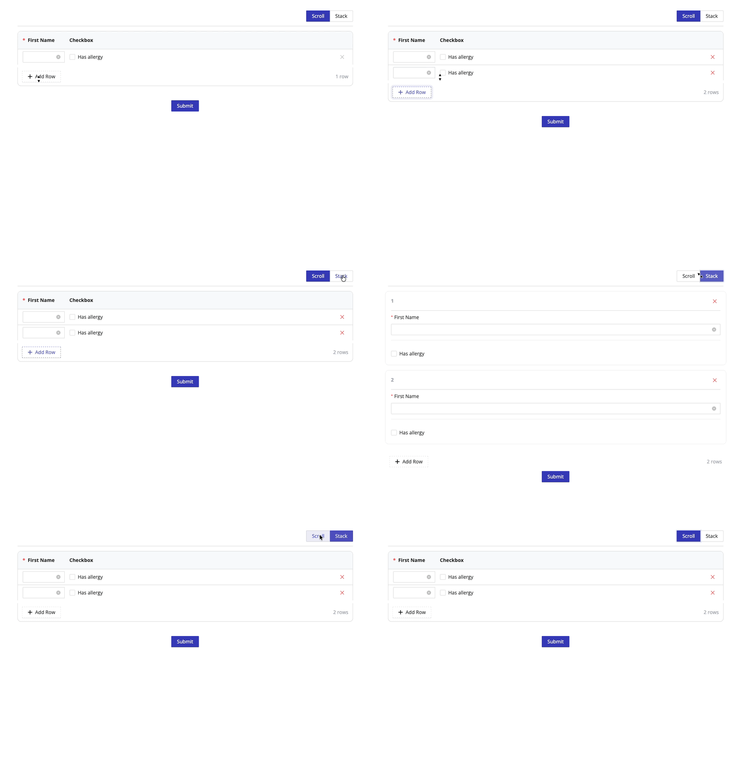
Stack mode works well even on desktop for forms where you expect long question text or complex inputs, it prevents the table from becoming too cramped horizontally.
| Row | Q&A Table | Entry Grid | |
|---|---|---|---|
| Best for | Standard side-by-side fields | Repeating questions with shared answer choices | Repeating sets of different input fields |
| Columns | 1-3 fixed columns | Configurable (Question + choice columns) | One column per component |
| Mobile | Stacks automatically | Scroll or Stack (configurable) | Scroll or Stack (configurable) |
| User can add rows | No | No | Yes |
| Supported components | Any | Single Choice, Multiple Choice only | Most input components (with exceptions) |
Related
- Conditional Logic: show or hide rows based on user input
- Screens: organize rows and tables across multiple form pages
- Single Choice: the component used for Q&A table questions
- Multiple Choice: the component used for Q&A table questions with multi-select
- Styling: customize the appearance of your form and tables